Oil Painting Colors for Painting Flowers
Katie Liddiard
Description
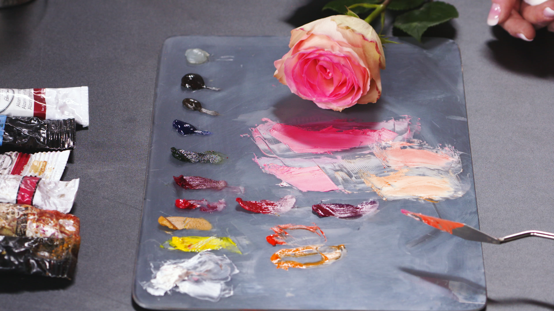
First, Katie compares modern quinacridone pigments in rose, red, and magenta (there are many more pigments in the quinacridone family as well) with more traditional alizarin red, an earthier tone. Each one mixes slightly differently, but the quinacridones are superior to alizarin in achieving floral colors. Mixed with white and a small amount of yellow, quinacridone rose yields a gorgeous pink, while alizarin creates a duller color (though it’s still a wonderful and versatile cool red that you’ll use often in painting many subjects). For flowers in the orange and yellow range, Katie pulls in cadmium orange, a strong pigment, and orange molybdate, a brilliant orange. Mixed with white, these can create the creamy flower-petal shades that are so gorgeous in nature.
If flowers are a favorite painting subject, be sure to explore the quinacridone family of pigments along with the vibrant oranges that Katie suggests. You’ll discover that you can learn to paint flowers expressively without ever being disappointed in the colors you can mix and the results you get.