Choosing A Color Palette for Floral Illustration
Mia Whittemore
Description
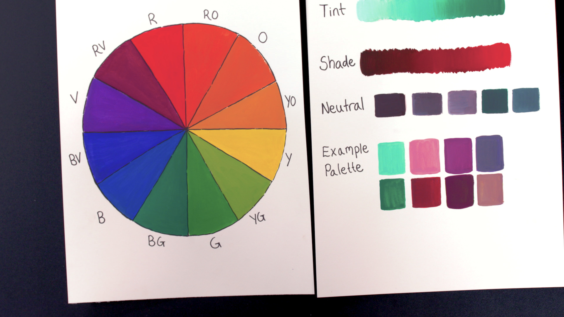
The color wheel can be divided up between warm and cool colors. Warm colors (red through oranges to yellow-green) are vibrant and active while cool colors (green though blues to red violet) recede into the background, says Mia. Complementary colors are directly opposite from one another on the color wheel and often look good together because they offer so much contrast between them. However, be aware that complementary colors can be bright and strong, says Mia. Analogous colors are next to one another on the wheel. For example, red-violet, red, and red-orange are all near each other on the color wheel. These colors are similar but different enough to add subtle contrast.
The color wheel is expanded when you add tints, shades, and neutrals to each color. To create a tint of any color you just simply add white to it to lighten it up. A shade is the opposite, you add black to a color, making it darker. Neutrals — white, browns, and grays — are more subdued colors that give the eye a rest when worked near brighter colors.
There is no right or wrong way to use colors, says Mia, but the color wheel is a tool to help you get started experimenting until you know what colors and combinations you like.